
A sieve analysis graph shows how soil or aggregate particles are spread by size. This test helps engineers check if materials meet construction standards. It’s widely used in road work, foundations, and concrete mix design. In this guide, you’ll learn how to plot the graph, step by step. You’ll also discover how to interpret the grain size curve and use Excel to create accurate distribution charts.
Key Takeaways from a Sieve Analysis Graph
- Used to check particle size distribution in soil and aggregates
- Focuses on particles larger than 0.075 mm
- Graph shows how much material passes each sieve size
- Helps in grading soil for roads, concrete, and foundation work
- Accuracy depends on proper sieves, sample prep, and testing
- Excel templates and macros can make graph creation faster
What Is a Sieve Analysis Graph?

A sieve analysis graph shows how particles are distributed by size. It comes from a test where soil or aggregate passes through stacked sieves. Each sieve has smaller openings than the one above it. The amount of material retained on each sieve is recorded in a table. This data forms the gradation curve, also called the grain size distribution curve.
The graph helps engineers check if the soil meets construction standards. It is most useful for particles larger than 0.075 mm. This analysis shows if the soil is well-graded, poorly graded, or uniform. That’s why it’s used in roads, foundations, and concrete design. Learn more about the sieve test to explore the full process of analyzing particle size distribution across different industries.
How to Plot a Sieve Analysis Graph (Step-by-Step)
Plotting a sieve analysis graph begins with separating soil or aggregate particles by size. This is done by passing the material through a stack of sieves with progressively smaller mesh openings.
Each sieve retains a portion of the sample based on particle size. The retained weights are recorded and used to calculate the cumulative percentage of material finer than each sieve size.
This data is then used to create a gradation curve—also known as a grain size distribution graph—which visually shows how the material is distributed across different particle sizes. Let’s walk through the full process step by step.
Step 1: Prepare the Soil Sample
Begin by collecting a representative soil sample. Make sure it’s dry and free from clumps. A common sample size is around 500 to 1000 grams, depending on the type of soil and the project requirements. This dry mass will be your starting point for calculations.
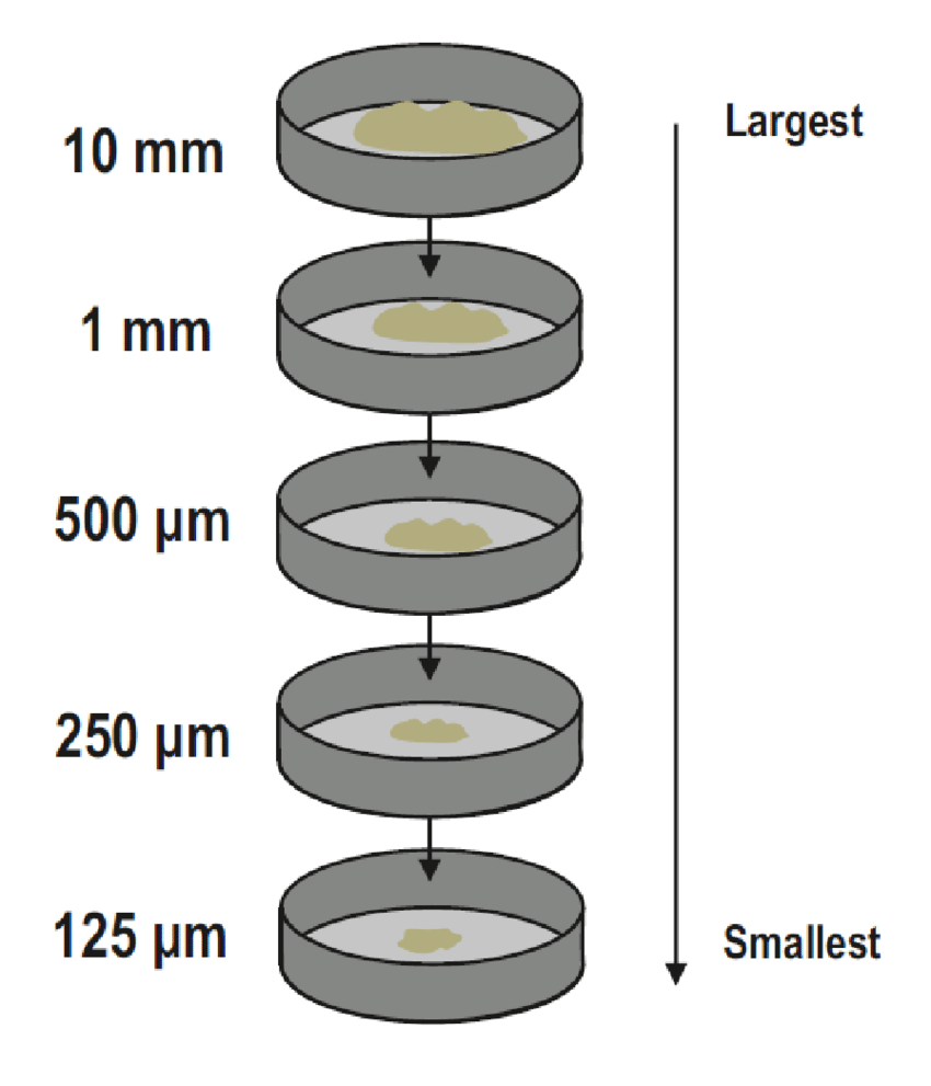
Step 2: Stack the Sieves
Next, arrange a set of standard sieves in decreasing order, with the largest mesh opening on top and the smallest (typically 0.075 mm) at the bottom. Don’t forget to place a pan underneath the stack to collect the finest particles that pass through all sieves.
Step 3: Sieve the Sample
Now pour your prepared sample into the top sieve. Use a mechanical shaker if available; otherwise, shake the stack by hand for about 10 to 15 minutes. This motion helps separate the particles according to size, with coarser grains staying on top and finer ones falling through.
Step 4: Weigh the Retained Soil
After sieving, carefully remove each sieve and weigh the amount of soil retained on it. Record the weight for each sieve. These values help determine how much material falls into each size category.
Step 5: Calculate Percent Retained and Percent Finer
With the weights recorded, you can now calculate the percentage of material retained on each sieve.
Use the formula: % Retained = (Weight on Sieve / Total Sample Weight) × 100
Then, to find the cumulative percentage passing (or finer), subtract the cumulative % retained from 100%. This gives you the distribution of particle sizes in your sample.
Step 6: Plot the Graph
Grab a semi-log graph paper or plotting software like Excel. On the X-axis (logarithmic scale), mark the sieve sizes. On the Y-axis (linear scale), mark the cumulative percentage finer. Plot the data points and connect them smoothly to form the grain size distribution curve.
Step 7: Analyze the Curve
Finally, analyze your curve. A well-graded soil will show a smooth, S-shaped curve, while a poorly graded or gap-graded soil might have flat spots or sharp jumps. You can also calculate specific diameters like D10, D30, and D60 from the curve — these help determine the uniformity coefficient (Cu) and coefficient of curvature (Cc), which are essential for understanding soil behavior.
How to Interpret a Sieve Analysis Graph
Now that you’ve plotted the graph and understand its significance, it’s time to make sense of the curve itself. The sieve analysis graph isn’t just a visual—it’s a story about your soil’s behavior and its performance in real-world applications.
Start by examining the shape of the curve. A smooth, S-shaped curve typically indicates well-graded soil, meaning there’s a wide range of particle sizes present. This kind of distribution helps particles compact efficiently, making the soil ideal for foundations and structural fill.
On the other hand, a steep or flat curve may point to poorly graded or gap-graded soil. Poorly graded soil has particles of mostly one size, which could lead to poor compaction and stability. Gap-graded soils show missing particle size ranges, which may create voids and reduce strength.
Key indicators from the curve include:
- D10: The particle diameter at 10% finer — useful for permeability estimates.
- D30 and D60: Help in calculating the Uniformity Coefficient (Cu = D60/D10) and Coefficient of Curvature (Cc = (D30²)/(D10 × D60)).
- Cu > 4 and 1 < Cc < 3 usually suggest a well-graded soil.
These values are more than just numbers. They help civil engineers decide whether the soil is suitable for use in roads, buildings, embankments, and more.
Creating and Reading a Sieve Analysis Graph (Step-by-Step)

Now that you know what the sieve analysis graph means, let’s walk through how to create one. This isn’t just about plotting points — it’s about understanding your material’s real-world behavior.
1. Prepare Your Data
To begin, weigh how much soil is retained on each sieve. Then:
- Divide the retained mass by the total mass of the sample.
- Multiply by 100 to get the percent retained.
- Add those percentages cumulatively to get the cumulative % retained.
- Subtract each cumulative % retained from 100 to find the cumulative % passing (finer).
That final column is what you’ll graph.
2. Plot the Grain Size Distribution Curve
Use semi-log graph paper:
- X-axis (log scale): sieve size (in mm or microns).
- Y-axis (linear scale): cumulative % finer (from 0 to 100%).
Plot each point and connect them smoothly. You now have the gradation curve.
3. Read the Curve Like a Pro
This curve shows whether your soil is well-graded or poorly graded. Look for key parameters:
- D10: 10% of particles are finer than this size.
- D30 and D60: help calculate Cu and Cc.
- A smooth curve? Likely well-graded. A flat or steep curve? Possibly poorly or gap-graded.
Practical Tips for Improving Sieve Analysis Graph Accuracy
Sieve analysis requires precision. Even a small inconsistency can distort your results, leading to costly construction errors. In this section, we’ll share practical tips to ensure accuracy — from selecting the right equipment to maintaining testing consistency — so your grain size distribution curve reflects reality.
Choosing the Right Sieves and Equipment
Using the proper sieves and equipment is your first step toward dependable results. Consider:
- Particle size range you’re working with
- Material being tested (soil, aggregate, etc.)
- Stability and quality of the sieve frame
Sieves vary widely: from 3″ to 12″ in diameter, with openings ranging from 125 mm down to 20 microns (635 mesh). Always match the sieve aperture to your sample type and target gradation.
Also remember:
- Use durable, certified sieves
- Avoid warped or worn screens
- Maintain proper temperature if sieving under heated conditions
And yes — don’t forget to clean and inspect them regularly.
Proper Sample Preparation
Proper sample prep sets the foundation for accurate analysis. Key steps include:
- Oven-dry the sample at 100°C before sieving
- Reduce aggregate to an appropriate size using quartering or riffle splitting
- Blend thoroughly to ensure the sample represents the entire batch
- Pour evenly around the top sieve’s surface to avoid bias
This ensures consistent material flow and prevents problems like sieve blinding or uneven particle distribution.
Maintain Consistency in Testing Procedures
Repeatability is everything. Stick to a standardized process every time you run a test. Recommended practices include:
- Regularly inspect sieves for damage or clogging
- Use the same agitation technique for each test (manual or mechanical)
- Clean sieves after every use
- Store sieves in a dry, protected environment
- Recertify sieves periodically if used for critical projects
Recommended Basic Testing Steps
To standardize your sieve analysis procedure, follow this routine:
- Weigh the dried sample
- Load it into the sieve stack
- Agitate for 5 minutes
- Weigh the material retained on each sieve
- Calculate the percentage retained
- Agitate for one additional minute to ensure thorough separation
Tip: Always monitor the uniformity coefficient (Cu) and coefficient of curvature (Cc) to verify the quality of the gradation.
By applying these best practices from equipment setup to testing habits — you’ll ensure your sieve analysis results are reliable, accurate, and suitable for critical decisions in construction and soil classification.
Advanced Techniques for Creating Sieve Analysis Graphs
Now that we’ve covered the basics, let’s take a step further and explore advanced techniques for creating sieve analysis graphs. These include using custom Excel templates and automating calculations with formulas and macros — perfect for professionals and students aiming to streamline their workflow.
Using Excel for Sieve Analysis Graphs
Excel is a powerful tool for generating particle size distribution plots. To start:
- Choose “XY (Scatter)” as your chart type
- Select the subtype: “Scatter with smooth lines and markers”
- Plot particle size (log scale) on the x-axis and percent finer on the y-axis
This approach helps visualize the grain size distribution clearly and consistently.
Custom Excel Templates for Sieve Analysis
Custom Excel templates especially those built for gradation analysis can be game-changers. These templates often include:
- Automatic grain size distribution charts
- Pre-set sieve sizes and particle size formulas
- Cumulative and percent finer calculations
- Pre-formatted data input areas
Benefits of using templates:
- Save significant time
- Minimize manual errors
- Quickly generate shareable reports
- Streamline repetitive tasks
- Improve consistency in analysis
Many labs and engineers use custom templates to maintain a standard format across projects.
Automating Calculations with Macros and Formulas
Macros and formulas bring automation into your sieve analysis. Here’s how they help:
Macros:
- Record and replay repetitive steps (e.g., sorting data, calculating percent finer, generating charts)
- Ideal for automating entire analysis sequences with one click
Formulas:
- Used to calculate: 1. Percent retained on each sieve 2. Cumulative percent retained 3. Percent finer 4. Coefficients like Cu and Cc
- Common Excel functions used: SUM, AVERAGE, LOG, IF, ROUND
Together, macros and formulas improve accuracy and efficiency, especially when analyzing multiple soil samples or large datasets.
Real Example – Applying Sieve Analysis Graphs in Construction
So far, we’ve explored sieve analysis from a theoretical and technical standpoint. Now, let’s bring it to life through a practical case study. This example will show how sieve analysis, especially the graph plays a key role in real construction projects. We’ll walk through the project background, results, graph interpretation, and what lessons were learned along the way.
Project Background and Objectives
Every construction project begins with specific goals — whether it’s building a road, laying a foundation, or ensuring proper drainage. These goals directly affect what kind of soil or aggregate is used and, in turn, how sieve analysis is conducted.
In this case, the project required a granular soil fill with high compaction and drainage capability. The engineers needed to understand the soil’s particle size distribution to ensure proper strength and permeability. That meant selecting the right sieve sizes and test methods to classify and verify the soil’s quality.
Sieve Analysis Results and Graph Interpretation
Once the lab testing was completed, the sieve analysis data was plotted on a grain size distribution graph. The curve showed the percentage of material finer than each sieve size giving a clear visual of how the soil particles were distributed.
This graph helped the engineers assess:
- Whether the soil was well-graded (a mix of many sizes)
- If there were gaps in the size range (poorly graded)
- The effective size (D10), uniformity coefficient (Cu), and coefficient of curvature (Cc)
However, some errors almost affected the results:
- Too much soil on a single sieve (overloading)
- Poor sample splitting, leading to non-representative results
- Incomplete sieve stack, which caused misinterpretation at fine particle levels
By spotting these issues early, the team re-tested using proper procedures.
Lessons Learned and Best Practices
This case reinforced a few critical best practices in sieve analysis:
✔ Choose the correct sieve range for the material
✔ Ensure samples are thoroughly dried, split, and representative
✔ Don’t overload sieves — this can skew results
✔ Clean and inspect sieves between tests to prevent contamination
✔ Recertify sieves periodically to maintain precision
Sieve analysis isn’t just about collecting data — it’s about making decisions that impact the safety and success of real-world structures.
Final Thoughts on Sieve Analysis Graph
To sum up, in this journey through sieve analysis, we explored the basics, detailed the process, and learned how to create and interpret sieve analysis graphs. We also shared tips for improving accuracy, looked at advanced techniques, and applied our knowledge to a real-world case study.
Sieve analysis is more than just sifting. It’s a powerful tool that reveals the complex nature of soils, helping in construction and engineering projects. By understanding sieve analysis and mastering accurate soil grading, we can ensure project success and contribute to building strong and reliable structures.
Certified MTP has the largest selection of aggregate testing supplies, including Sieve Shaker Machines, test sieves, Sample Splitters and Dividers, and Specific Gravity Test Equipment.
FAQs About Sieve Analysis Graph
What is the use of a graph for sieve analysis?
The sieve analysis graph shows the particle size distribution of a material. It helps visualize how much material is retained on each sieve and how much passes through, making it easier to interpret the average, smallest, and largest particle sizes. This graph is key in soil classification and construction material quality control.
What is the S curve for graph for sieve analysis?
The S-curve is a graphical plot of cumulative percent passing (on the y-axis) versus sieve opening size (on the x-axis, usually logarithmic scale). It often forms an S-shape, especially for well-graded soils, indicating a smooth transition across a range of particle sizes.
How do you analyze the graph for sieve analysis?
Start by calculating the percentage retained on each sieve. Then compute the cumulative percent retained, and subtract that from 100% to find the percent passing. Plot this on a semi-log graph to observe the grain size distribution curve. From the curve, you can identify key values like D10 (effective size), D30, and D60 to assess soil gradation and uniformity.
How do you represent the particle size distribution in graph for sieve analysis?
The particle size distribution is shown as a smooth curve on a graph, with sieve size (in mm or µm, x-axis) plotted logarithmically, and cumulative percent passing (y-axis) plotted linearly. The shape of the curve reveals whether the material is well-graded (wide range of particle sizes) or poorly graded (uniform size).
What is the fundamental principle of sieve analysis?
Sieve analysis separates particles by size using a stack of sieves with decreasing mesh openings. When shaken, particles smaller than a sieve pass through, while larger ones remain. This method helps determine the size distribution of materials like soil, sand, or aggregates.
What does a well-graded vs. poorly graded soil curve look like?
A well-graded soil has a smooth, wide S-curve that covers a broad range of particle sizes. A poorly graded soil has a steep or flat curve, indicating limited variation in grain size — either mostly fine or mostly coarse particles.
What is D10, D30, and D60 in sieve analysis?
These are specific points on the grain size distribution curve:
- D10: 10% of the sample is finer than this size (effective size)
- D30 and D60: 30% and 60% finer respectively
These values help calculate the Uniformity Coefficient (Cu = D60/D10) and Coefficient of Curvature (Cc = D30² / (D10 × D60)).
Why use a semi-log graph in sieve analysis?
Soil particle sizes vary across several magnitudes. Using a logarithmic x-axis for particle size helps display a wide size range more clearly and provides a better shape to the S-curve, improving analysis accuracy.
What are common errors in sieve analysis graph interpretation?
Errors may include overloaded sieves, improper sample splitting, inadequate shaking time, or ignoring fines smaller than the lowest sieve. These can distort the curve and lead to poor decisions in material selection.
View the full line of Aggregate Testing Products and Aggregate Moisture Testing Equipment, especially the popular Aggregate/Sand Moisture Measurement System